MásFit
UX/UI Designer Adobe XD
Role
UX/UI Designer
Core Responsibilities
Design thinking • UX strategy • Interface design • Visual design • Responsive design • Interaction design
Key Deliverables
Wireframes • User flows • Interactive prototypes • Smartwatch interface design • UI components • Fitness dashboard design
The Problem
The MásFit mobile experience gave users access to detailed fitness and wellness information, but interacting with a phone isn't always practical during a workout.
When users are exercising, they may be moving continuously, have limited attention available, and need to check information without interrupting their activity.
This created a different UX challenge:
How might we give users the information they need while minimizing the amount of time and effort required to interact with the device?
Rather than simply shrinking the mobile interface onto a smartwatch, I approached the wearable as a different interaction environment with different user needs.
Designing for glanceability
One of the primary design considerations was determining which information users needed to see immediately versus what could remain secondary.
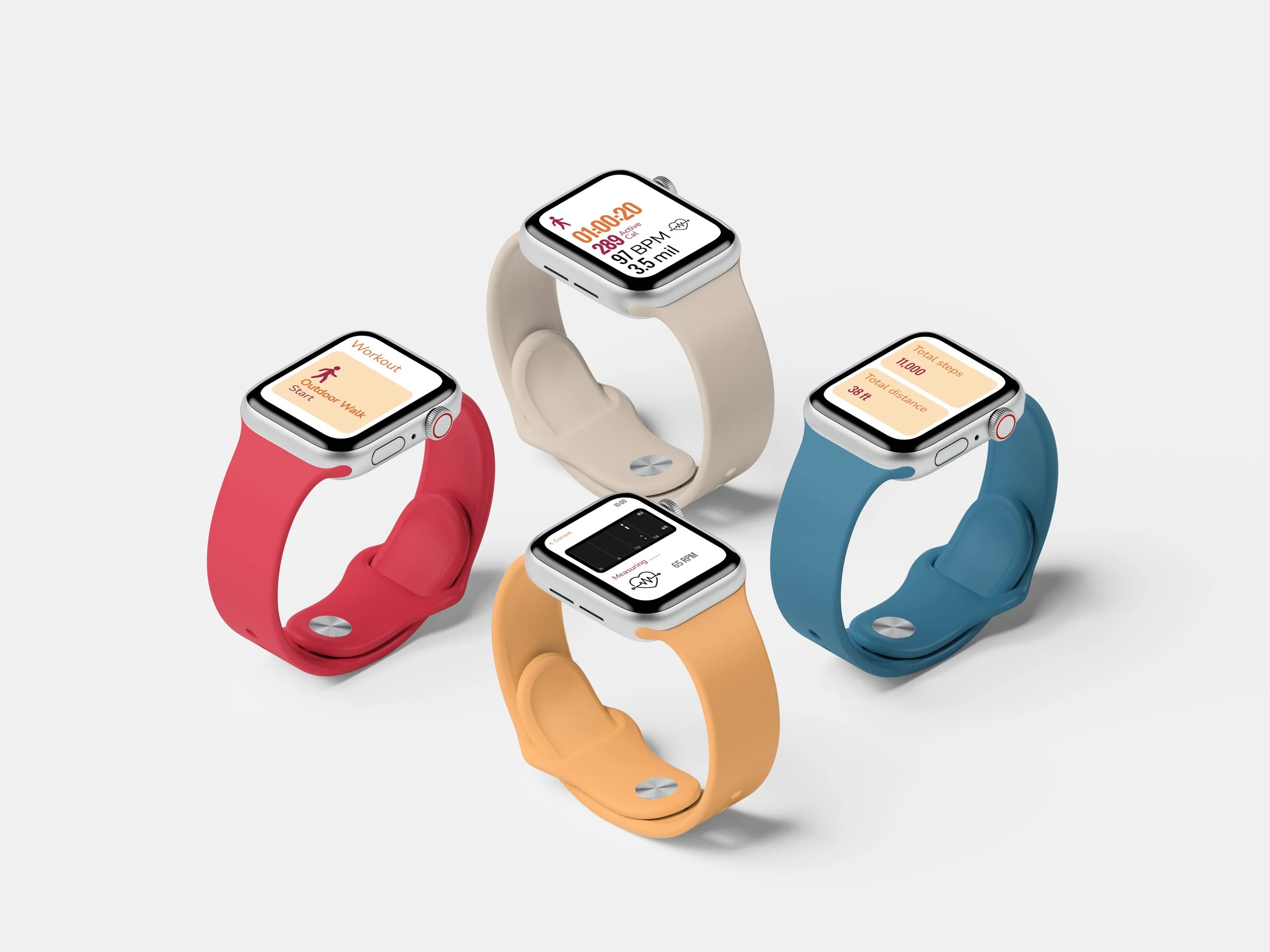
I prioritized metrics such as:
Heart rate
Steps
Workout progress
Activity status
These metrics were given stronger visual hierarchy so users could identify them quickly without navigating through multiple screens.
Why?
A mobile interface can accommodate more information because users typically have more screen space and can dedicate more attention to interacting with it.
A smartwatch cannot. Putting every metric on the same visual level would increase cognitive load and make the interface harder to scan.
The design decision: prioritize the most actionable information and reduce secondary content.
This created a dashboard optimized for quick visual scanning rather than prolonged interaction.
Reducing interaction during workouts
I designed the navigation around the assumption that users would often interact with the watch while physically active.
This influenced the number of actions presented at once, the information hierarchy, and the overall simplicity of the interface.
Instead of requiring users to move through multiple screens to find their workout data, key metrics were surfaced directly within the dashboard.
Why is this better?
A deeper navigation structure may work well on a phone, but on a small wearable screen it introduces unnecessary steps.
For example:
Multiple navigation steps:
Open app → select workout → select metrics → view data
Simplified experience:
Open app → immediately view essential workout data
The second approach reduces interaction cost and allows users to return their attention to their activity more quickly.
Designing for readability
Because the interface needed to be understood at a glance, typography, spacing, and contrast became functional UX decisions rather than purely visual choices.
I used clear typographic hierarchy to distinguish the metric itself from supporting information.
For example:
148
BPM
The large number communicates the primary piece of information first, while the smaller label provides context.
This hierarchy allows users to understand the data without having to read an entire screen.
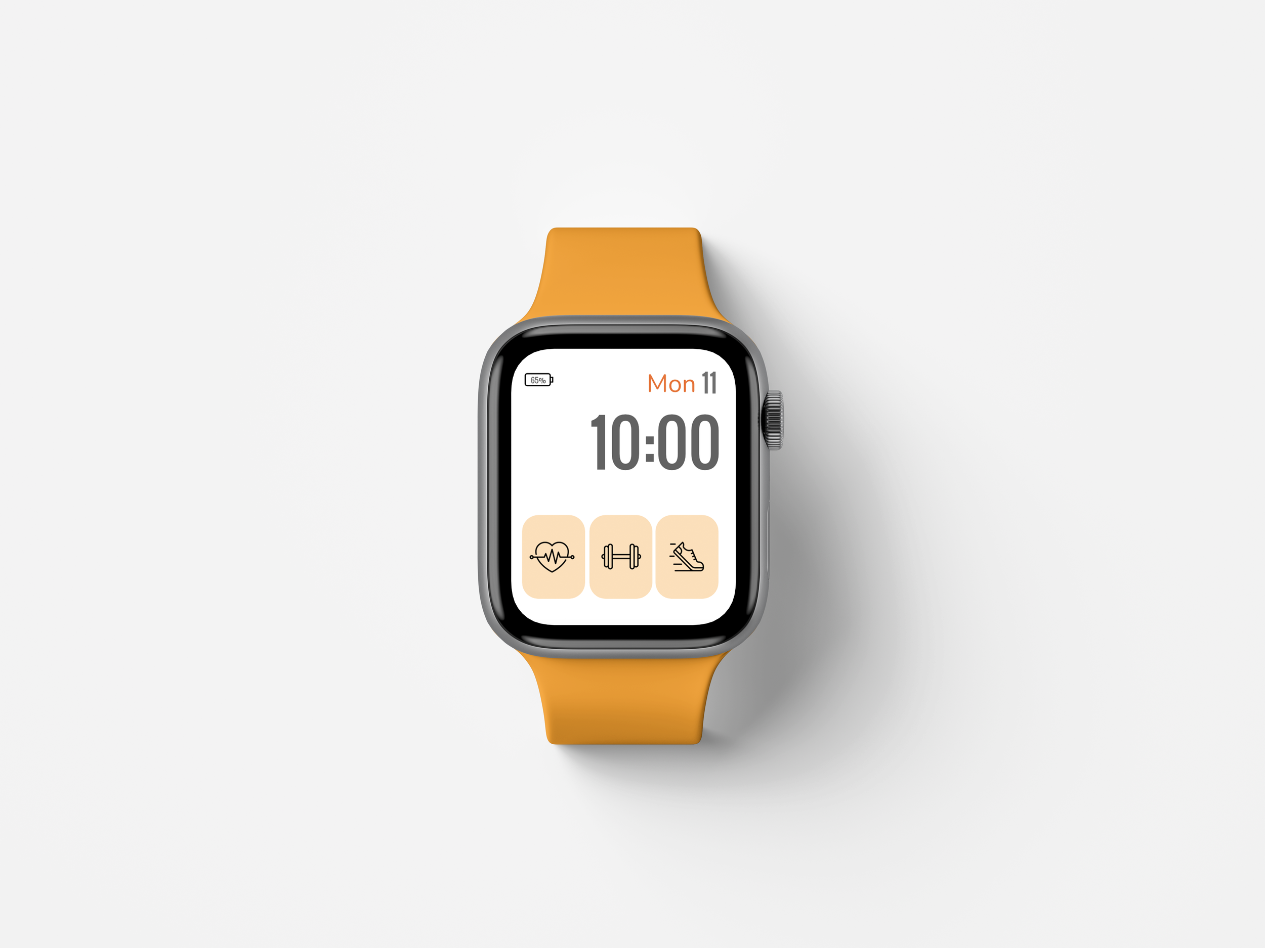
Designing the watch face
The watch face extended MásFit's experience beyond an individual workout.
Instead of treating the watch face as purely decorative, I explored how it could provide useful fitness information at a glance.
The design surfaced relevant activity information while maintaining the fundamental function of a watch face: telling time quickly and clearly.
This required balancing two competing priorities:
Utility vs. visual simplicity
Adding more fitness information could make the watch face more informative, but too much information would compete with the time and create visual clutter.
I therefore prioritized a small number of high-value metrics rather than attempting to replicate the full mobile dashboard.
Creating a connected ecosystem
The wearable experience was designed as an extension of the larger MásFit ecosystem rather than a standalone product.
The mobile application could support deeper exploration, planning, and content consumption, while the wearable could provide quick, real-time feedback during activity.
This created a complementary relationship between the two platforms:
Mobile → Explore, plan, and engage
Wearable → Monitor, glance, and act
The goal was not to make both experiences identical. It was to give each device a role based on how users interact with it.
From research insight to design decision
Building upon the research and design insights from the larger MásFit platform, I translated user needs into wearable-specific design principles:
User NeedDesign ResponseQuickly check workout progressPrioritized real-time metricsInteract while movingSimplified navigationUnderstand information immediatelyStrong visual hierarchyAvoid unnecessary interruptionsReduced interaction stepsAccess fitness information throughout the dayFitness-focused watch faceMaintain consistency across devicesShared visual language
Outcome
The MásFit wearable experience expanded the product beyond the mobile screen by designing specifically for the constraints and behaviors of wearable technology.
Rather than treating the smartwatch as a smaller version of the mobile application, I designed around the unique context of wearable use: short interactions, limited screen space, physical activity, and the need for immediate information.
This project demonstrates my ability to translate research insights into platform-specific UX decisions and balance functionality, accessibility, visual hierarchy, and interaction efficiency across devices.