Locāl mobile application
UX/UI Designer & Visual Designer
Role
UX/UI Designer
Core Responsibilities
User research • Design thinking • UX strategy • User journey mapping • Interaction design • Visual design
Key Deliverables
User journey maps • Wireframes • Interactive prototypes • UX flows • UI designs • High-fidelity mockups
The problem
Traveling somewhere unfamiliar can be exciting, but discovering what to actually do can also become overwhelming. Travelers are often presented with hundreds of restaurants, attractions, activities, and recommendations. The challenge isn't necessarily a lack of information—it's finding the right information quickly. Generic recommendation platforms can also make users sort through options that don't match their interests, schedule, or reason for traveling.
This led to the central design question:
How might we help travelers discover experiences that feel personally relevant without making them spend more time searching?
Locāl was designed to reduce the amount of decision-making required to find meaningful experiences in an unfamiliar destination.
Understanding the user
I began by researching the behaviors and needs of people traveling for both leisure and business.
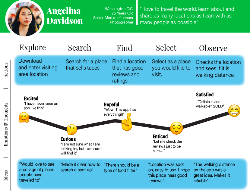
I mapped the user's journey from planning → arriving → exploring → reflecting, looking for moments where users might experience friction.
This helped identify several key challenges:
Too many options can make deciding what to do difficult.
Travelers may not know which experiences are actually relevant to them.
Searching across multiple platforms creates additional effort.
Recommendations become less useful when they aren't connected to a user's interests.
Business and leisure travelers may have very different amounts of time available.
These insights shifted my focus from building another travel directory to designing a personalized discovery experience.
Designing for discovery, not search
One of the most important product decisions was to emphasize discovery alongside traditional search.
A conventional travel app might require users to know what they're looking for:
Search → "Italian restaurant" → Browse results → Compare options
But travelers don't always begin with a specific destination or activity in mind. Locāl instead allows users to discover recommendations based on their interests and preferences.
Why?
Search works well when users have a specific goal. Discovery works better when users know they want to do something but don't necessarily know what that something is. By supporting both behaviors, Locāl reduces the pressure on users to formulate the perfect search query before they can find something relevant.
Personalization
Rather than presenting every traveler with the same recommendations, I designed the experience around user interests and preferences. This allowed the product to prioritize experiences that were more likely to be relevant.
For example, a traveler interested in food and local culture should not have to navigate through the same generic recommendations as someone primarily interested in nightlife or outdoor activities.
Why personalization?
Without personalization, users have to perform the filtering themselves.
That creates additional cognitive effort:
Generic recommendations → User evaluates → User filters → User compares → User decides
Personalized recommendations aim to shorten that process:
User preferences → Relevant recommendations → User decides
The goal was not to remove choice, but to make the choices presented to the user more meaningful.
Mapping the user journey
I created user journey maps to understand what travelers might be thinking, doing, and feeling throughout the experience.
Rather than looking at individual screens in isolation, the journey map helped me identify opportunities to reduce friction across the entire experience.
For example, a traveler might move through:
"Where should I go?"
↓
"What interests me?"
↓
"What options fit my preferences?"
↓
"Which one should I choose?"
↓
"How do I get there?"
Each step represents a potential point of uncertainty. This informed the decision to make recommendations, categories, and supporting information easy to access without forcing users to repeatedly return to the beginning of their search.
Simplifying navigation
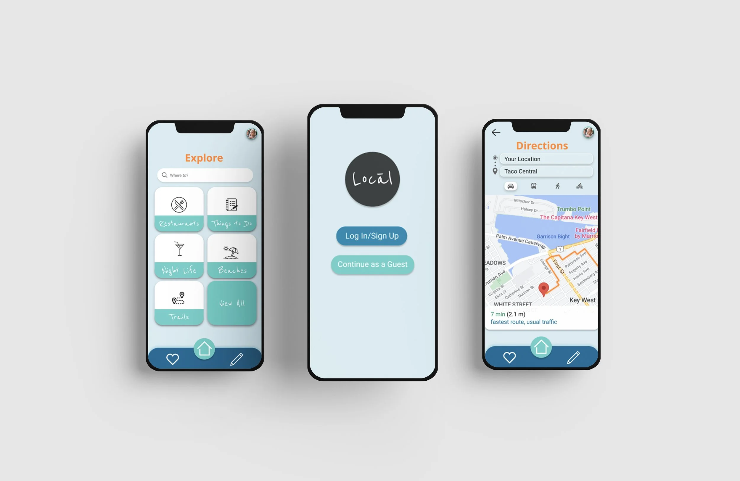
Travel applications can quickly become complicated because they need to accommodate several types of content: destinations, restaurants, activities, maps, profiles, saved experiences, and recommendations. I used user flows and wireframes to establish a clear hierarchy before developing the visual interface. The goal was to make the primary actions predictable:
Discover → Explore → Evaluate → Save/Act
Rather than exposing every available feature at once, the interface guides users toward the next logical action.
Why this approach?
Showing more options does not necessarily create a better experience. When too many choices are presented simultaneously, users have to spend more time determining where to begin. A focused navigation structure reduces that decision-making burden and keeps the user's attention on discovering experiences.
Designing recommendations for quick evaluation
Recommendations need to communicate enough information for users to decide whether something interests them without requiring them to open every result. Therefore I considered the hierarchy of information presented within recommendation cards. The most important information should be immediately recognizable, while secondary details can be revealed as the user explores further.
This creates a progressive disclosure approach:
At a glance:
What is it? Where is it? Why might I like it?
After selecting:
More detailed information needed to make a decision.
Why?
If every detail is displayed immediately, recommendation cards can become visually dense.
If too little information is shown, users have to repeatedly open and close results.
Progressive disclosure creates a middle ground: enough information to evaluate an option quickly without overwhelming the user.
Designing for different travel contexts
Not every traveler approaches a destination the same way.
A leisure traveler may have several hours to explore, while a business traveler might only have an hour between meetings.
This influenced the way I thought about personalization.
The product shouldn't only ask:
"What do you like?"
It should also consider:
"What are you trying to do right now?"
This creates an opportunity for recommendations to become more contextually relevant rather than simply being based on static interests.
Iteration
I translated the journey-map insights into user flows and low-fidelity wireframes before moving into high-fidelity UI.
This allowed me to evaluate the structure of the experience before committing to visual details.
The progression was:
Research → Journey Mapping → User Flows → Wireframes → Prototype → UI Design
This process helped separate usability decisions from visual decisions.
For example, I could determine whether users could successfully move from discovering an experience to evaluating it before spending time refining colors, typography, and visual components.
Outcome
Locāl explores how personalization and thoughtful information architecture can make travel discovery more manageable. Rather than attempting to compete with the enormous amount of information already available to travelers, the product focuses on helping users find the information that is most relevant to them.
The project demonstrates my ability to:
Conduct and apply user research
Identify user pain points
Map end-to-end user journeys
Translate insights into product requirements
Design personalized experiences
Develop information architecture and user flows
Create wireframes and interactive prototypes
Apply progressive disclosure and visual hierarchy
Design for different user contexts
Most importantly, Locāl demonstrates my approach to product design:
The goal isn't to give users more options. It's to help them make better decisions with less effort.