Elon Explorers
UX/UI Designer & Visual Designer
Role
UX/UI Designer & Visual Designer
Core Responsibilities
User experience design • Design thinking • User research • Interface design • Branding • Accessibility design
Key Deliverables
User flows • Wireframes • Interactive prototypes • UI designs • Website redesign • Logo redesign • Spanish website translation
The problem
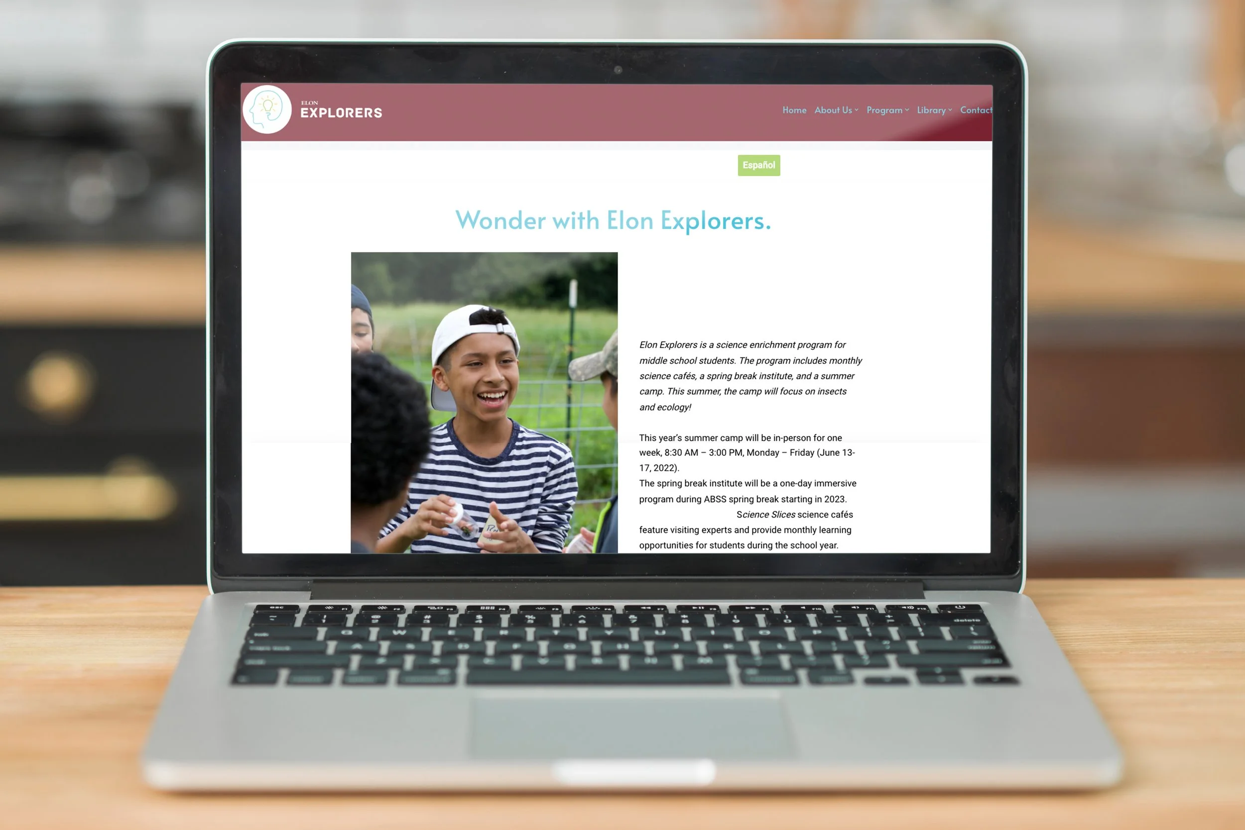
Elon Explorers is a science enrichment program designed to introduce middle school students to hands-on learning and STEM experiences.
The website needed to serve more than one audience. Students needed to understand what the program offered and feel excited about participating, while parents and families needed to quickly find practical information and determine whether the program was a good fit.
This created a central design challenge:
How might we make the program's digital experience engaging for students while making important information easy for parents and families to find?
A second consideration was accessibility. Because the program serves a diverse community, the experience needed to be understandable and usable by families who may prefer to access information in Spanish.
Understanding the users
I considered the needs of the website's primary audiences:
Students
Want to understand what the program is and what they will actually do.
Respond to engaging visuals and approachable content.
Need information presented in a way that feels interesting rather than overly institutional.
Parents & Families
Need to quickly understand the program's purpose, activities, logistics, and value.
Need clear navigation to make decisions about participation.
May access the site on different devices and with different language preferences.
These different needs influenced both the information architecture and visual design.
Designing around multiple audiences
One of the biggest UX challenges was balancing engagement with information clarity.
A visually exciting website could appeal to students but make important information harder for parents to find. Conversely, a highly informational layout could communicate everything clearly but fail to create excitement around the program.
I therefore used visual hierarchy to establish a distinction between:
"Why should I be interested?"
and
"What do I need to know?"
More engaging visual content was used to communicate the program's experience and personality, while navigation and content structure made practical information easier to locate.
This approach allowed the website to be both inspiring and functional rather than optimizing for only one audience.
Simplifying navigation
I developed user flows and wireframes to determine how users should move through the website before focusing on the visual layer.
Rather than forcing users to search through pages to understand the program, I organized the experience around the questions a prospective family is most likely to have:
What is Elon Explorers?
What will students experience?
Who is the program for?
What opportunities are available?
How can I learn more or participate?
Why?
Navigation should reflect the user's mental model rather than the organization's internal structure.
If information is organized around internal categories that make sense to the organization but not to the visitor, users have to spend additional effort figuring out where information lives.
The redesign therefore prioritized clear labels and predictable pathways to reduce that cognitive effort.
Designing for accessibility
Accessibility was considered as more than a compliance requirement.
The goal was to make information easier to understand and interact with for a broader range of users.
This influenced decisions around:
Typography and readability
Information hierarchy
Navigation clarity
Visual contrast
Content organization
Language accessibility
Instead of relying solely on visual cues, the interface was structured so that important information could be identified through clear hierarchy and labeling.
The result was an experience designed to be easier to navigate regardless of a user's familiarity with the program.
Spanish translation as a UX decision
I translated the website into Spanish to make the program's information more accessible to bilingual families.
This was not treated as simply replacing English words with Spanish equivalents.
Translation affects interface design because Spanish copy can differ in length and phrasing from English. This means layouts, buttons, navigation labels, and content blocks need enough flexibility to accommodate both languages.
Why this approach?
A website that provides a Spanish version but has layouts that break or become difficult to scan in Spanish creates a different kind of accessibility problem.
I therefore considered the translated experience as part of the overall UX rather than an afterthought.
The goal was to allow Spanish-speaking families to access the same essential information and opportunities without having to depend on an English-speaking family member to navigate the site.
Redesigning the logo
The existing logo also presented an opportunity to improve communication.
Because the logo appears at different sizes and across different contexts, readability was an important consideration.
I redesigned the mark with a focus on:
Legibility → ensuring the name could be recognized quickly.
Scalability → ensuring the identity remained effective at different sizes.
Relevance → creating a visual identity that better reflected science, exploration, and youth education.
A logo can look visually appealing while still creating usability problems when reduced in size or placed within a website header. The redesign therefore considered the logo as a functional part of the digital experience—not just a decorative element.
Outcome
The Elon Explorers redesign demonstrates how UX, visual design, branding, and accessibility can work together to support a real community program.
Rather than designing solely around aesthetics, I approached the website as a communication tool between the organization and its audiences.
The project strengthened my ability to:
Design for multiple user groups
Translate research insights into interface decisions
Develop user flows and information architecture
Design accessible digital experiences
Account for multilingual content
Balance visual storytelling with usability
Connect branding decisions to digital UX
Most importantly, the project reinforced a core principle of my design process:
Good design isn't simply about making information look better. It's about making the right information easier for the right person to understand, access, and act on.