Lidl Headquarters
Marketing Graphic Design Specialist
Role
Graphic Design Specialist • Digital Retail Design
Core Responsibilities
Digital retail design • Visual communication • Information hierarchy • Promotional design • Brand consistency • Cross-functional collaboration
Key Deliverables
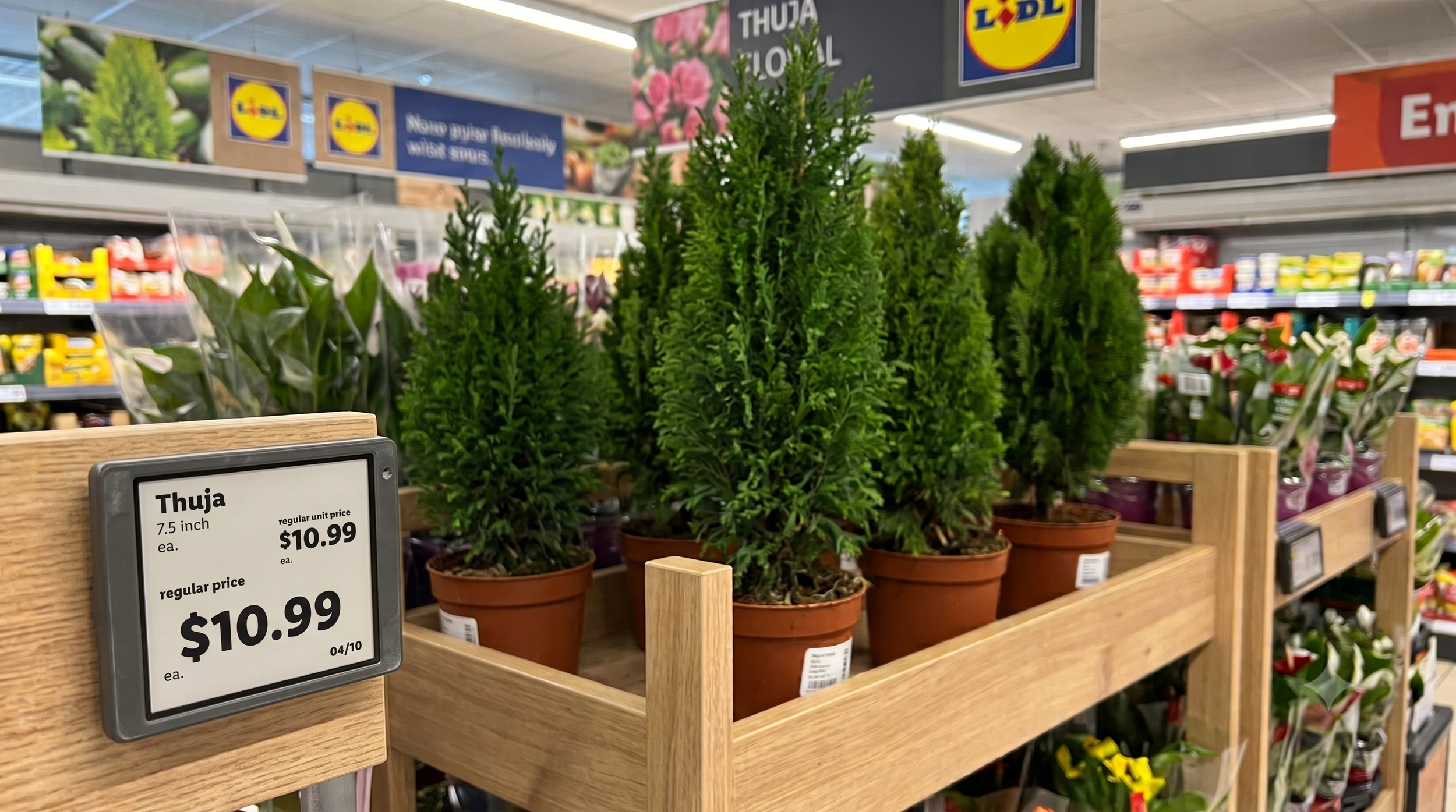
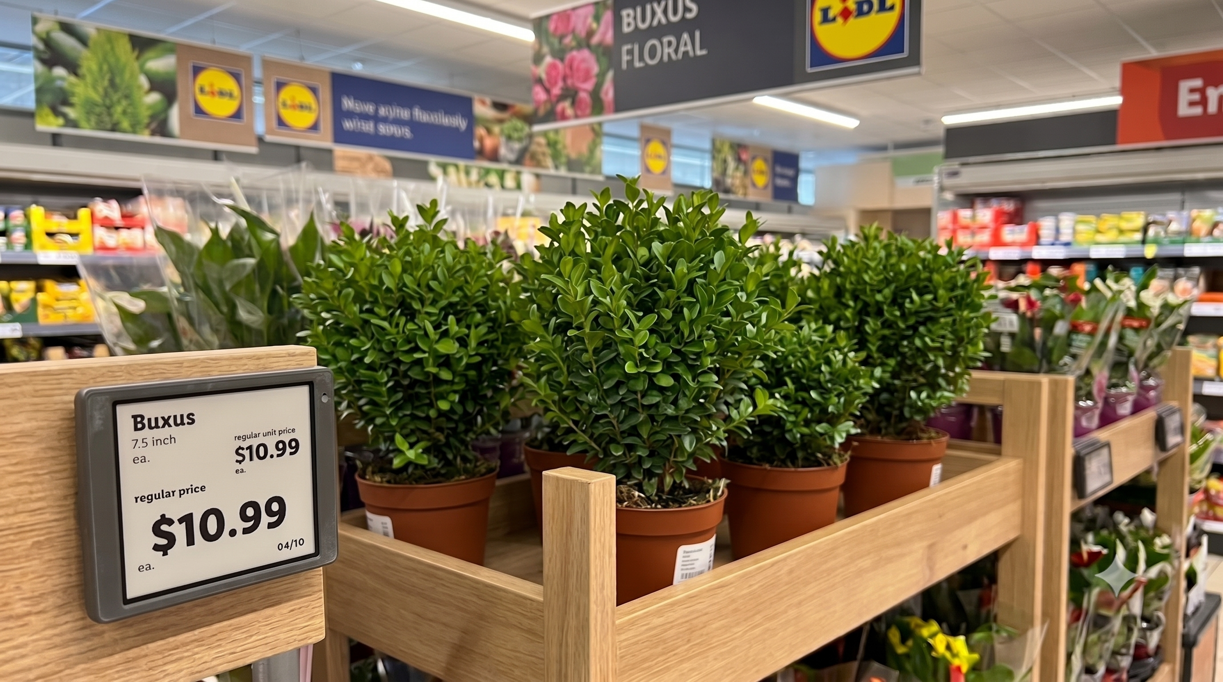
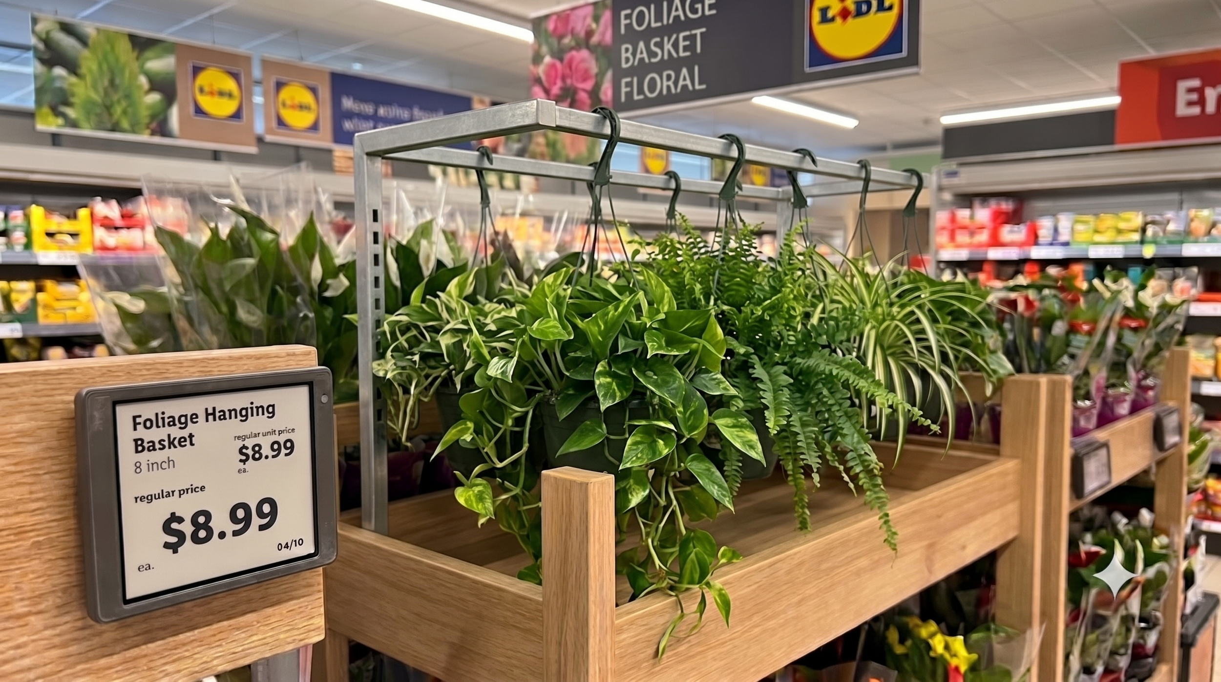
Electronic Shelf Label (ESL) graphics • Promotional pricing layouts • Product information displays • Branded digital assets • Campaign-specific ESL content • Retail-ready design files
The Challenge
Electronic Shelf Labels (ESLs) communicate essential information at the point of purchase, but their compact screens create a different design challenge from traditional print signage. Customers need to quickly identify the product, price, promotion, and relevant details without being overwhelmed by limited screen space.
The challenge was to determine:
How can we communicate the most important information clearly when space, attention, and viewing time are limited?
Designing for Quick Scanning
I prioritized information based on what customers need to understand first at the shelf.
Product → Price → Promotion → Supporting information
Rather than giving every element equal visual emphasis, I used scale, spacing, typography, and positioning to establish a clear hierarchy.
Why?
A dense layout may allow more information, but it also increases the effort required to find the information that matters. For an ESL, a simpler hierarchy is more effective because customers can identify key information at a glance rather than searching through competing elements.
Designing Within a Small Screen
Unlike a traditional advertisement, an ESL cannot rely on large layouts or extensive supporting copy. I focused on concise messaging and intentional use of space, removing or minimizing information that wasn't necessary to the immediate purchasing decision. This created a balance between information density and readability.
The goal wasn't to fit as much information as possible—it was to make the right information immediately understandable.
Promotional Communication
Promotional ESLs required particular attention to the relationship between the regular price and promotional price. I used visual hierarchy to distinguish the most important pricing information and make promotional value easy to recognize. This helped create a clearer path for the customer:
What is the product? → What does it cost? → Is there a promotion?
Connecting Digital & Physical Retail
I designed ESL content to align with Lidl's broader promotional campaigns across print, POS, and digital channels. Rather than treating the ESL as an isolated screen, I maintained consistent visual cues across touchpoints while adapting the content to the limitations of the display. This helped create a more cohesive customer experience—from seeing a promotion in an advertisement to encountering it at the shelf.
Designing With Accuracy as a UX Requirement
Because ESLs communicate pricing directly at the point of purchase, accuracy was just as important as visual execution. I collaborated with cross-functional teams to ensure promotional information and pricing were correctly represented before production. This reinforced an important principle of retail design: Clarity without accuracy isn't effective communication.
Outcome
This project strengthened my ability to design for constrained digital environments, where usability depends on prioritization rather than simply adding more information.
It demonstrates my ability to:
Design for fast-scanning users
Establish information hierarchy
Simplify complex promotional content
Design within technical and spatial constraints
Maintain consistency across retail touchpoints
Collaborate across marketing and merchandising teams
Balance visual design with functional communication
The project reinforced my approach to visual design:
When space is limited, good design isn't about showing everything. It's about making what matters easiest to see.