Niños de Nueva Esperanza
Lead Graphic Designer
Role
Lead Graphic Designer
Core Responsibilities
Creative strategy • Brand identity • Design thinking • User research • Visual design • Bilingual localization
Key Deliverables
Brand identity • Logo redesign • Brand style guide • Website design • Spanish/English website localization • Marketing graphics • Infographics • Mockups
Project Overview
As the Lead Graphic Designer for a fly-in project in Dorado, Puerto Rico, I led the visual rebranding of NNE, a nonprofit supporting under-resourced communities in Sabana Seca. Through user research, stakeholder collaboration, and design thinking, I developed a visual identity that better communicated NNE's mission while creating a more approachable and cohesive experience for its audiences.
The Challenge
NNE needed a visual identity that could speak to multiple audiences, including community members, donors, investors, and organizational partners. The challenge was balancing credibility and professionalism with a sense of accessibility and connection to the community NNE serves.
The organization also needed to communicate with both English- and Spanish-speaking audiences, making language and accessibility an important part of the overall design experience—not simply a translation task.
Research & Design Decisions
I used research and stakeholder input to identify the qualities the brand needed to communicate: community, trust, accessibility, and impact. These insights informed the visual direction and helped establish a more intentional relationship between the organization's mission and its identity.
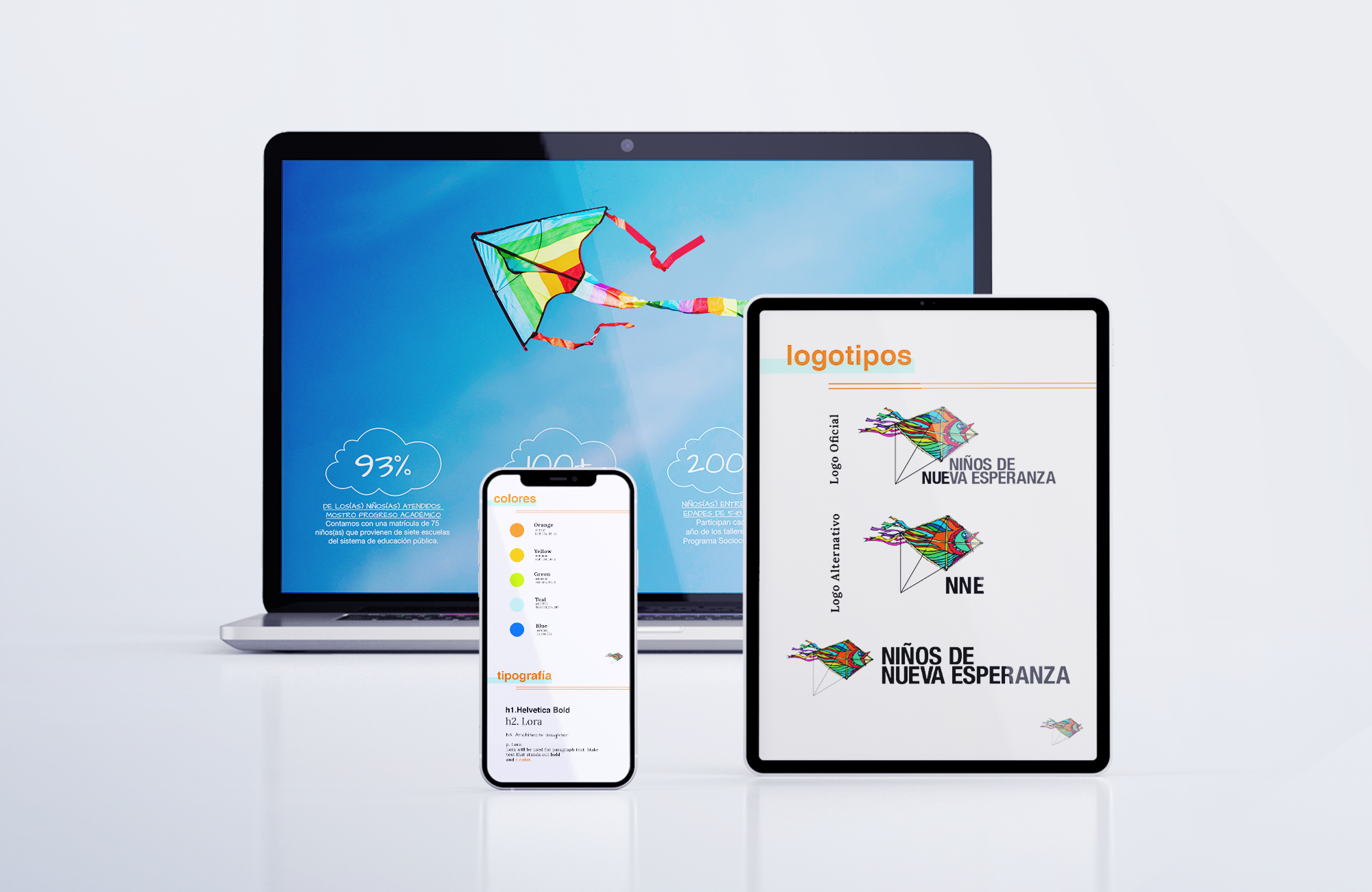
For the logo redesign, I prioritized clarity, recognition, and flexibility. A simpler, more legible mark performs better across different sizes and applications than a visually complex logo, allowing NNE to maintain a consistent identity across digital and printed materials.
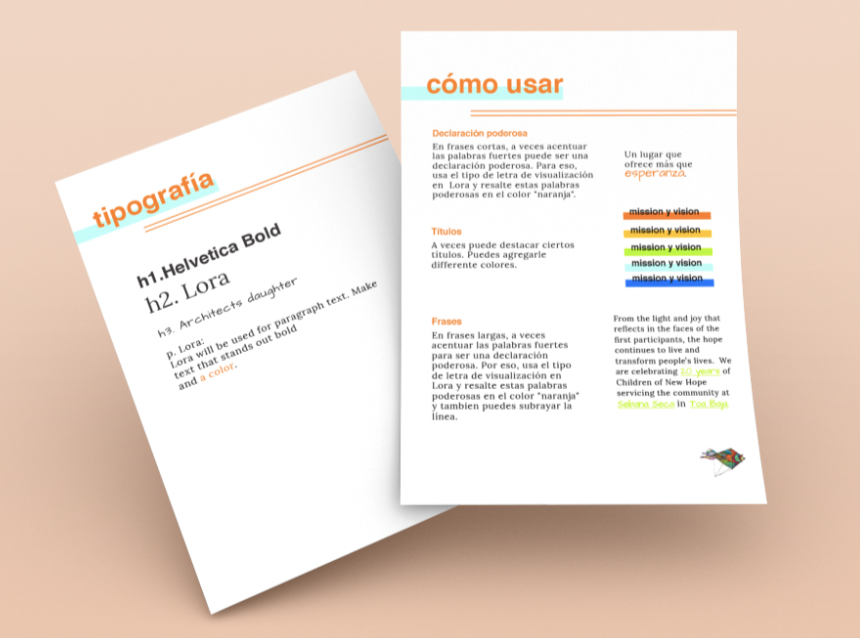
I developed a brand style guide to establish consistent typography, color, imagery, and visual usage. This created a scalable design system rather than relying on individual graphics to communicate the brand. Consistency was especially important because NNE needed to communicate across multiple audiences and touchpoints.
For the website, I organized information around what users would need to understand quickly: who NNE is, the communities it supports, its impact, and how visitors can get involved. This helped prioritize user needs over simply presenting information based on the organization's internal structure.
Bilingual & Accessible Design
I localized the website in English and Spanish, treating translation as part of the UX rather than simply replacing English copy with Spanish. Spanish text can require different amounts of space, so I designed layouts with enough flexibility to accommodate variations in copy length without compromising hierarchy or readability.
Providing both languages also reduced the need for users to rely on someone else to access important information, creating a more inclusive experience for NNE's diverse audiences.
Outcome
The rebrand created a cohesive visual foundation across NNE's logo, website, marketing materials, and informational graphics. More importantly, the project allowed me to apply research, visual communication, accessibility, information hierarchy, and bilingual UX principles to a real-world nonprofit brand.