MásFit
UX/UI Designer & Visual Designer
Role
UX/UI Designer • Product Designer • Visual Designer • Content Creator • Videographer
Core Responsibilities
UX research • Product strategy • User-centered design • Interface design • Branding • Content creation • Motion design
Tools
Adobe XD • Adobe Illustrator • Adobe Photoshop • Unreal Engine • Rokoko Studio
Timeline
January – April 2022
Application Prototype
The problem
Many fitness platforms are designed around a one-size-fits-all approach. For Spanish-speaking women in the United States, that can create barriers beyond simply finding a workout. Language, cultural representation, unfamiliar food recommendations, and a lack of community can make an otherwise useful fitness platform feel disconnected from the user's everyday life.
MásFit was created to explore a different approach: What would a fitness experience look like if language, culture, and community were treated as part of the user's wellness journey rather than secondary features?
The design challenge was to create a mobile experience that felt approachable, culturally relevant, and easy to navigate, while still providing the functionality users expect from a modern fitness platform.
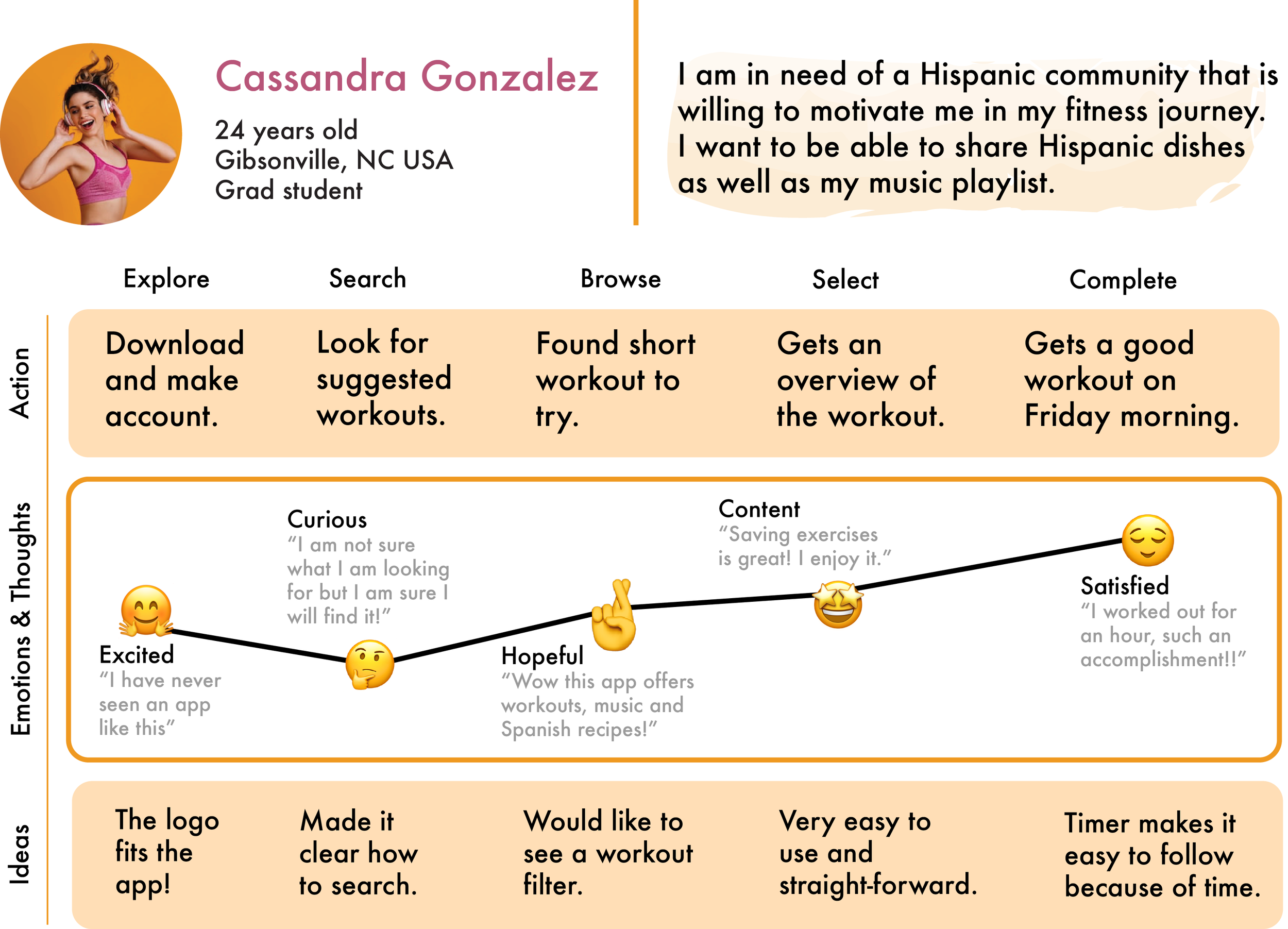
Understanding the user
I focused on the needs of Spanish-speaking women who wanted to incorporate fitness and wellness into their routines without feeling disconnected from their language or cultural identity.
This led me to consider several key user needs:
Accessibility: Users should be able to understand and navigate the experience without having to translate content.
Cultural relevance: Nutrition and wellness content should feel familiar rather than generic or culturally disconnected.
Motivation: Users need ways to maintain momentum beyond simply completing individual workouts.
Community: Sharing progress and goals can make fitness feel more social and accountable.
Simplicity: Fitness applications can contain a large amount of information, so important actions need to be easy to find.
These needs became the foundation for the product's information architecture and feature decisions.
Design Challenge
The challenge wasn't simply to translate an existing fitness application into Spanish. A translated interface could solve a language barrier, but it wouldn't necessarily solve the broader experience. Therefore I designed MásFit around three principles:
Understand me.
Content and navigation should feel immediately understandable.
Represent me.
Food, music, imagery, and community should reflect the user's cultural context.
Support me.
The experience should encourage continued participation rather than treating fitness as a series of isolated workouts.
Designing the Experience
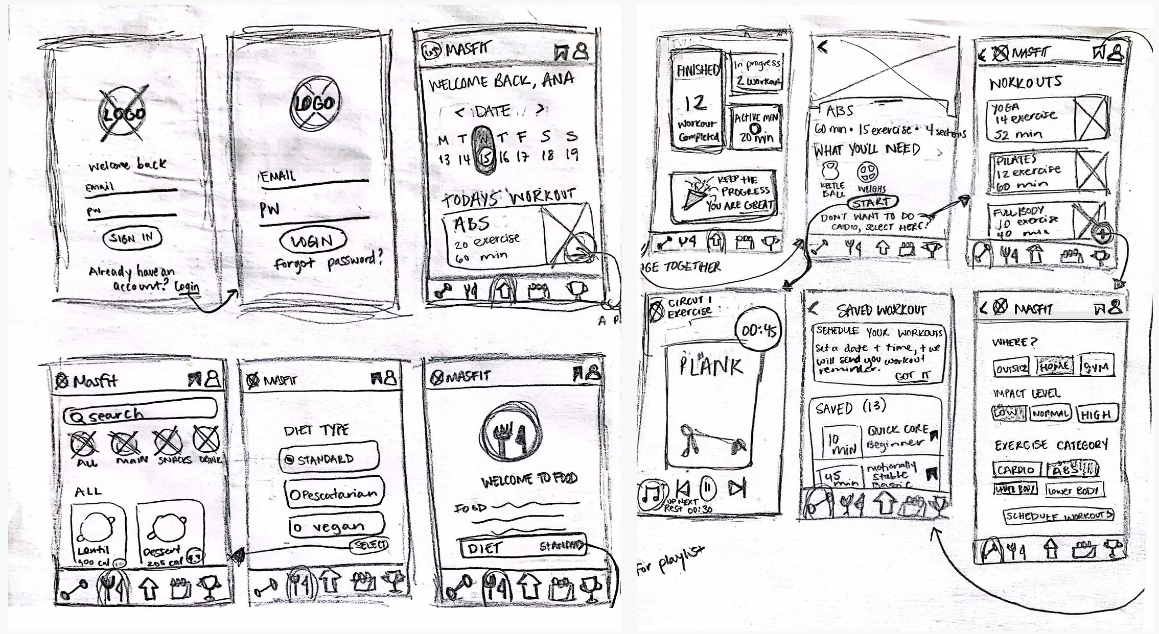
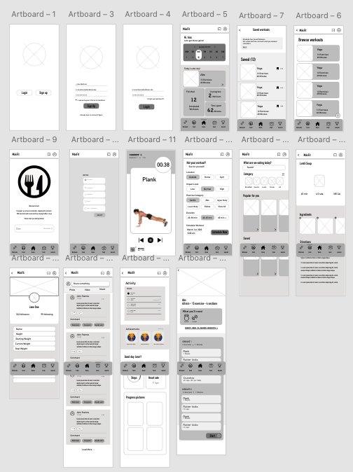
1 . Making Navigation Simple
Fitness applications can quickly become feature-heavy: workouts, progress tracking, nutrition, playlists, profiles, and community content all compete for attention. Rather than giving every feature equal visual weight, I structured the experience around the user's most frequent tasks. The primary navigation prioritized the core areas of the product while secondary content was kept accessible without competing with the main actions.
Why this decision?
A navigation system with too many equally prominent options increases cognitive load and makes users spend more time figuring out where to go. By establishing a clear hierarchy, the interface helps users answer the question:
"What can I do here?"
before asking them to explore everything the product offers.
2. Designing for Spanish first
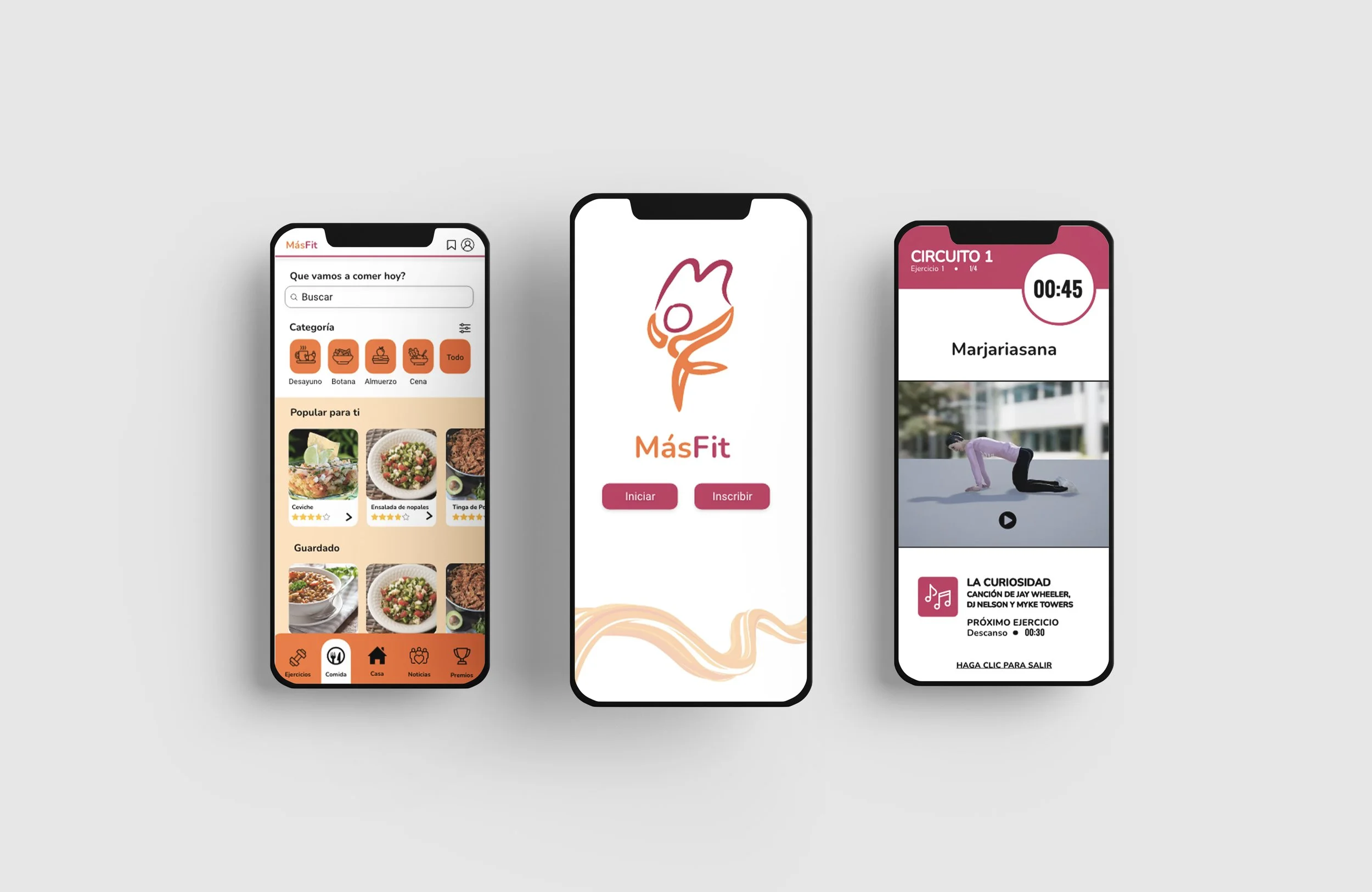
Spanish wasn't treated as a secondary translation layer. It was considered part of the product experience from the beginning. Interface labels, buttons, instructional content, and wellness information were designed around a Spanish-speaking audience rather than simply translating an English interface. This influenced the amount of space allocated to text and the hierarchy of information.
Why this decision?
Spanish and English don't always require the same amount of space to communicate the same idea. Designing around the intended language helps prevent cramped labels, awkward wrapping, and inconsistent hierarchy.
The goal was an interface that felt native to the user rather than translated for the user.
3. Making nutrition culturally relevant
Rather than presenting nutrition as a generic database of "healthy foods," MásFit incorporated authentic Latin American recipes. This was a deliberate product decision. A fitness application can tell users what they should eat, but recommendations become more useful when they connect with foods users already recognize, prepare, and enjoy.
Design principle:
Instead of asking users to adapt their culture to the product, the product should adapt to the user's context. The recipe experience therefore became more than a content feature—it supported the larger goal of making wellness feel achievable within the user's existing lifestyle.
4. Using music as a motivational tool
Music was incorporated into the experience through curated Latin music playlists. This decision connected the workout experience to something already familiar and culturally relevant to the target audience. Rather than treating music as an unrelated entertainment feature, I considered how it could contribute to motivation and create a stronger emotional connection with the product. This also gave MásFit an opportunity to differentiate itself from fitness platforms that rely primarily on generic workout content.
5. Designing community around accountability
Fitness motivation can be difficult to sustain when the experience is entirely individual. MásFit incorporated a community feed where users could share goals, progress, and achievements. The purpose wasn't simply to add a social-media-style feed. The feature was intended to support accountability and encouragement. The design therefore emphasized progress and goals rather than making social interaction the primary purpose of the application.
Why this approach?
The community feature supports the user's fitness journey without turning the product into a general-purpose social network.
6. Exploring immersive 3D workouts
I explored how emerging technology could make workout instruction more engaging by creating 3D workout demonstrations using Unreal Engine and Rokoko Studio. Rather than relying exclusively on static illustrations or conventional video, I experimented with an interactive visual approach that could demonstrate movement and form in a more immersive way. This exploration allowed me to consider how emerging technologies could complement—not replace—clear UX. The technology was valuable only when it improved the user's understanding of the exercise.
Visual & Brand Design
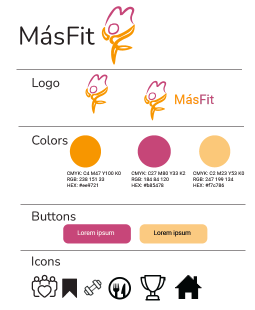
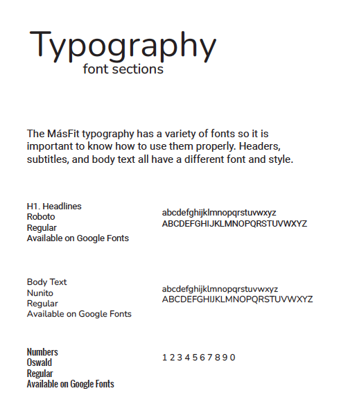
The visual identity was designed to communicate energy, wellness, inclusivity, and cultural connection without relying on stereotypical representations of Latin American culture. I used the brand system to create consistency across the application, while maintaining enough contrast and hierarchy to keep functional elements easy to identify. The visual design supported the UX rather than existing separately from it:
Brand → establishes emotional connection
Visual hierarchy → establishes clarity
Interaction design → establishes usability
Outcome
MásFit became an exploration of how a fitness product can be designed around a specific user's language, culture, motivations, and everyday context.
The project demonstrates my ability to move beyond visual execution and think through:
User needs and pain points
UX research and product strategy
Information architecture
Navigation and hierarchy
Cultural considerations
Content strategy
Visual identity
Prototyping
Emerging technology
Most importantly, MásFit demonstrates my approach to product design: design decisions should have a reason behind them.
Instead of asking only "Does this screen look good?", I considered:
"What is the user trying to accomplish, what might prevent them from accomplishing it, and how can the design make that easier?"